︎︎︎ home page
INFO ⋰ Graphic & Editorial Design 👩🏽💻
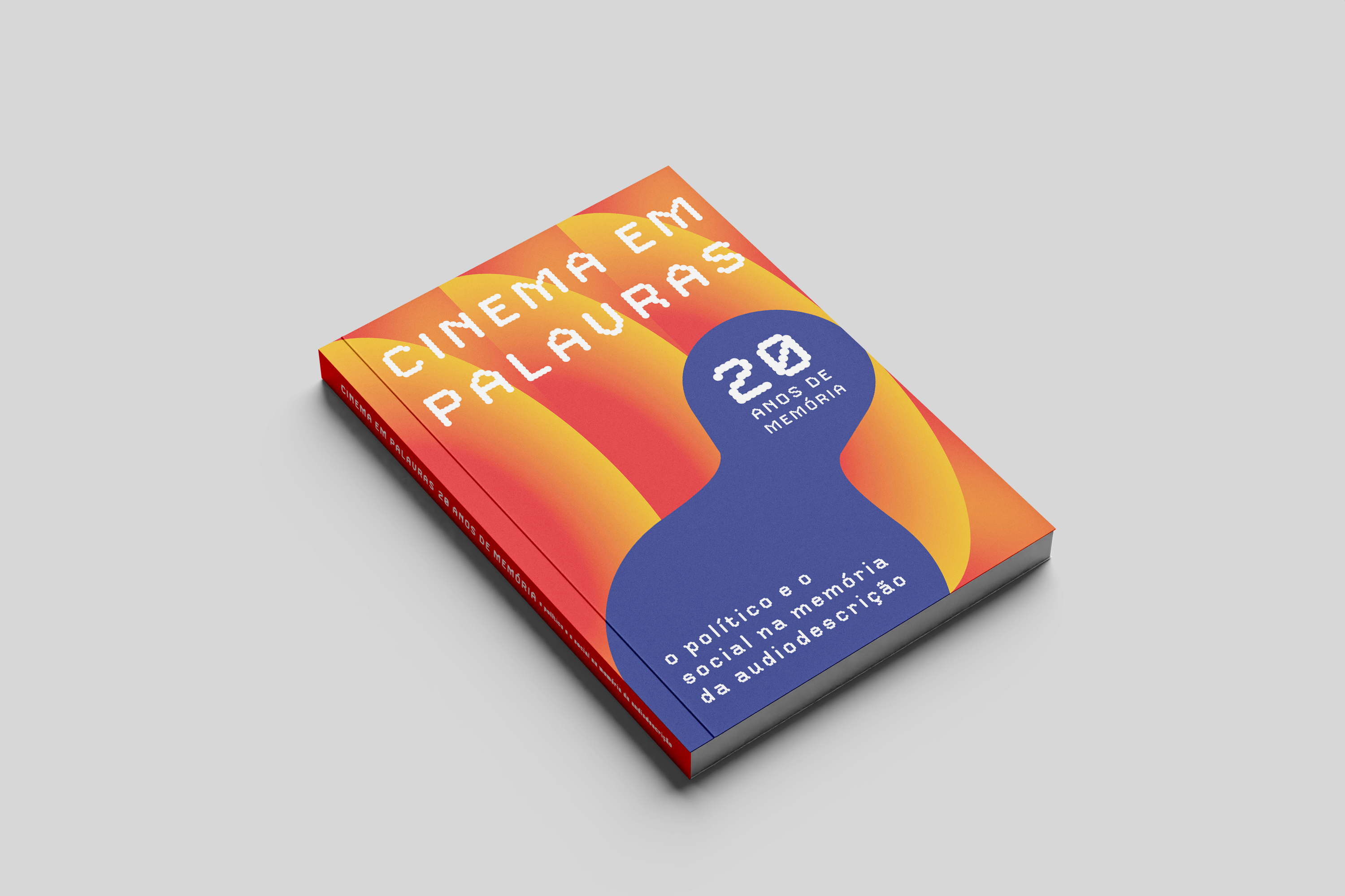
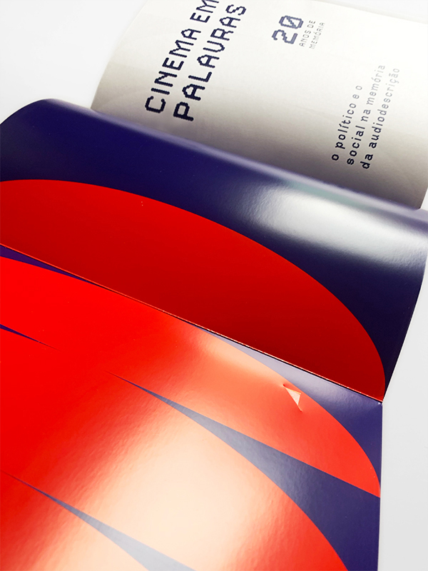
CINEMA EM PALAVRAS book.
Design and layout of the editorial
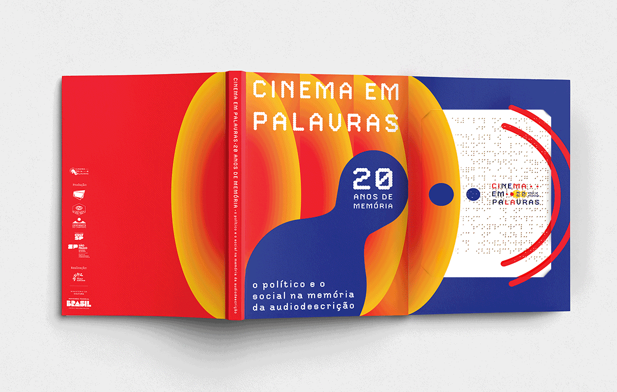
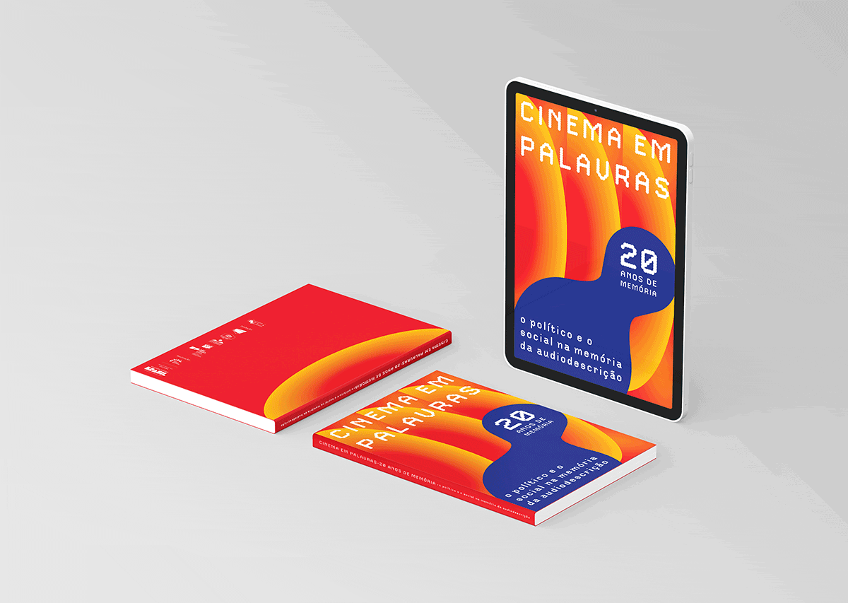
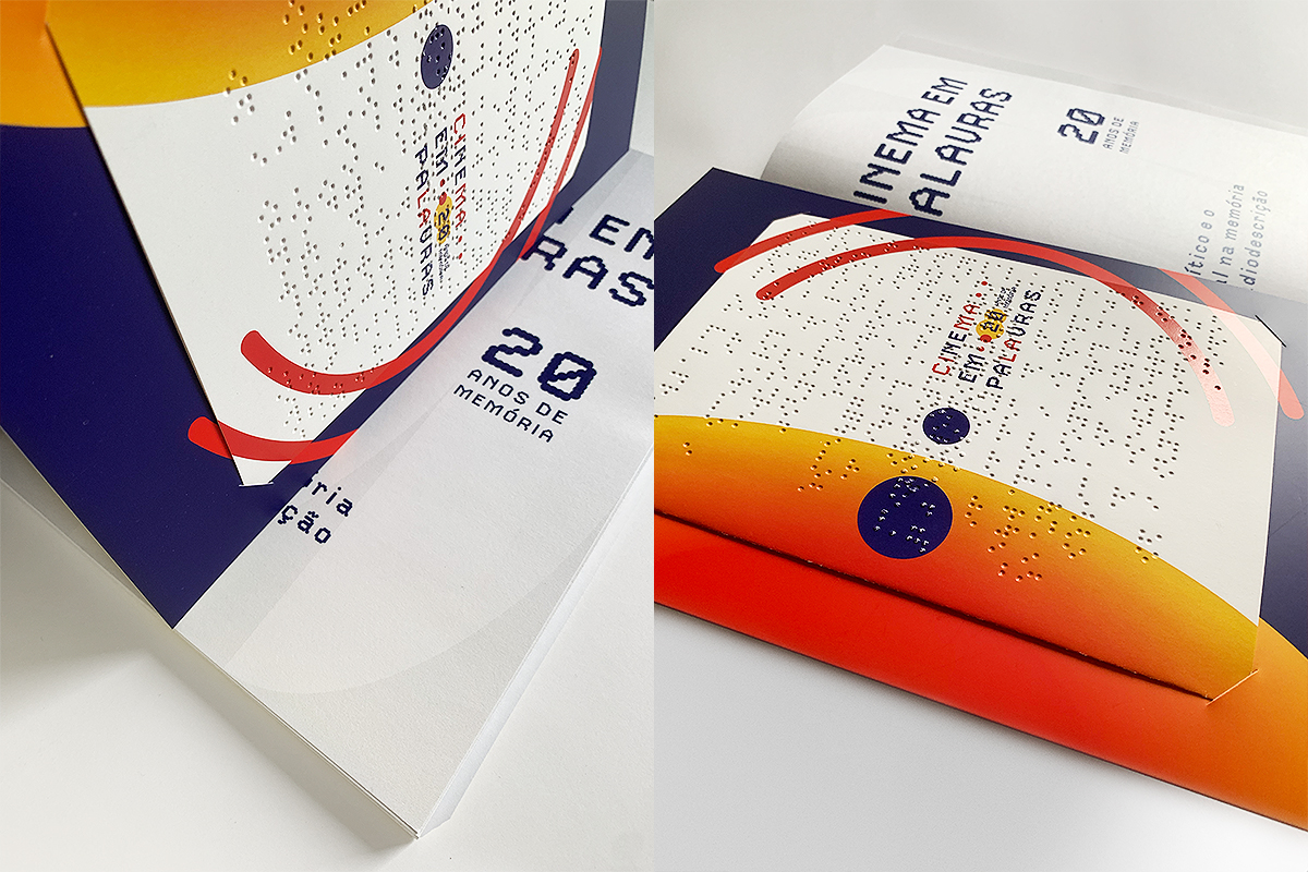
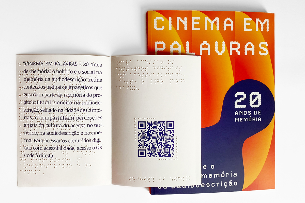
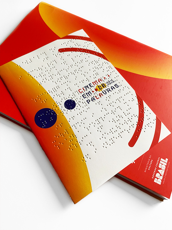
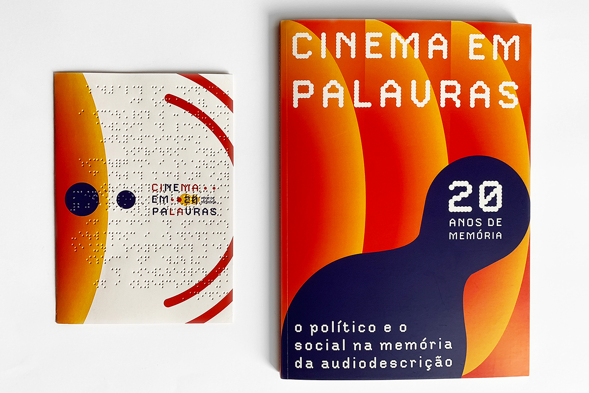
project for the book ︎ “CINEMA IN WORDS - 20 years of memory: the political and social in the memory of audio description”. A special publication featuring photographs, reports, critical texts, interviews, together with a Braille insert, documenting the 20-year history of the project carried out at the Braille Cultural Centre in Campinas (São Paulo, Brazil), as a cultural hub and benchmark for social responsibility in the city promoting inclusive cinema for people with visual impairment. This unique edition of the book came in two formats, PRINT (with larger font size) and DIGITAL (PDF of the book programmed with audio description), both designed to ensure accessibility for people with low vision or total vision loss.
︎
Design e paginação do projeto editorial do livro ︎ "CINEMA EM PALAVRAS - 20 anos de memória: o político e o social na memória da audiodescrição". Uma publicação especial, que apresenta fotografias, relatos, textos críticos, entrevistas, juntamente com um encarte em braille, documentando a trajetória de 20 anos do projeto realizado no Centro Cultural Braille de Campinas (São Paulo-Brasil), como ponto de cultura e referência de responsabilidade social na cidade para o cinema inclusivo às pessoas com perda visual. Esta edição única do livro teve dois formatos, IMPRESSO (com uma tipografia de escala maior) e DIGITAL (PDF do livro programado com audiodescrição), ambos com o design projetado para assegurar acessibilidade, sejam àquelas pessoas de baixa visão ou com perda total da visão.
PROCESS ⋰ Creation of the project's graphic identity
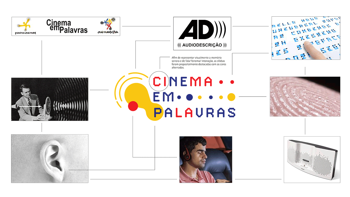
TYPEFACES ⋰
DotStudio from MyFonts (headlines/featured texts)
Classified as a Dot Font Display typeface with a contemporary design, this font was selected to be part of the project's identity because its typographic anatomy visually resembles the writing system used in Braille, which is also composed of dots.
Noticia Text from Google Fonts (running text )
A serif font with a contemporary, humanistic design was chosen because it has an optimised anatomy, with various weights, which promotes good legibility and works well both on screens and in printed texts.
︎︎︎ NEXT PROJECT